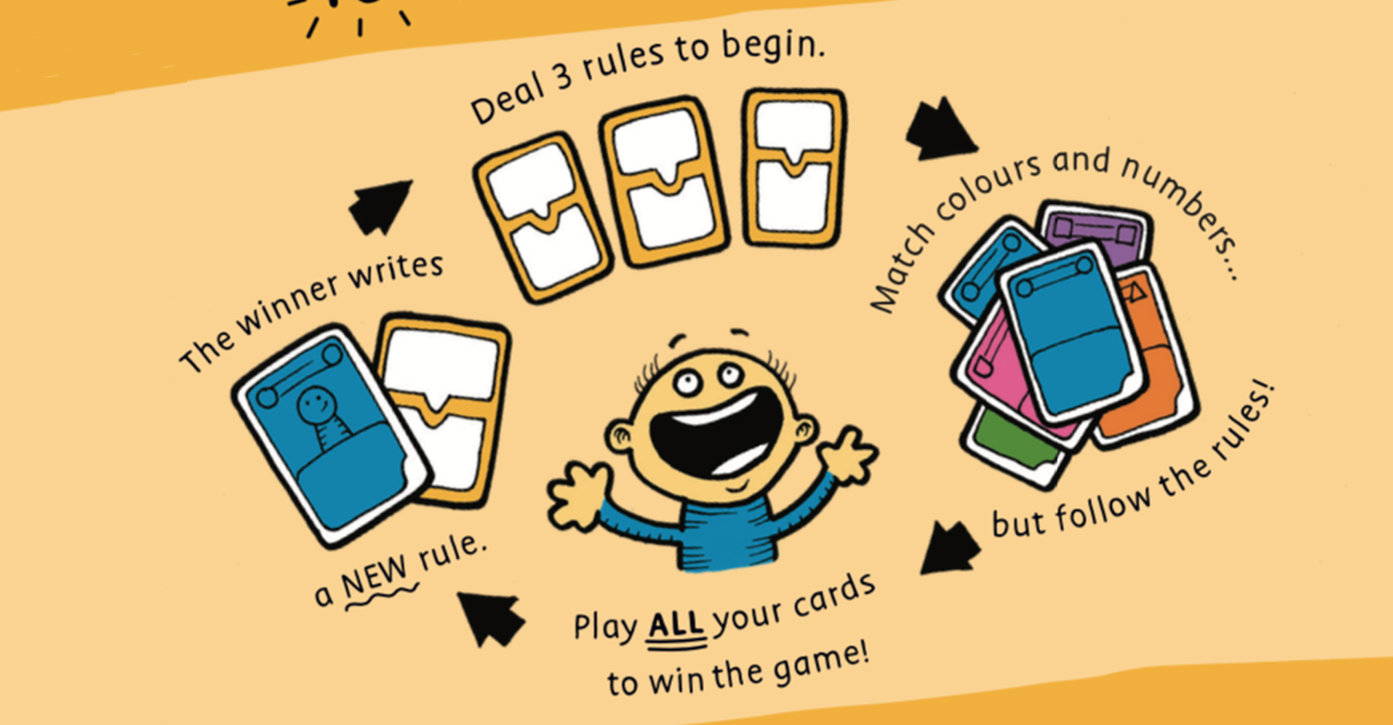
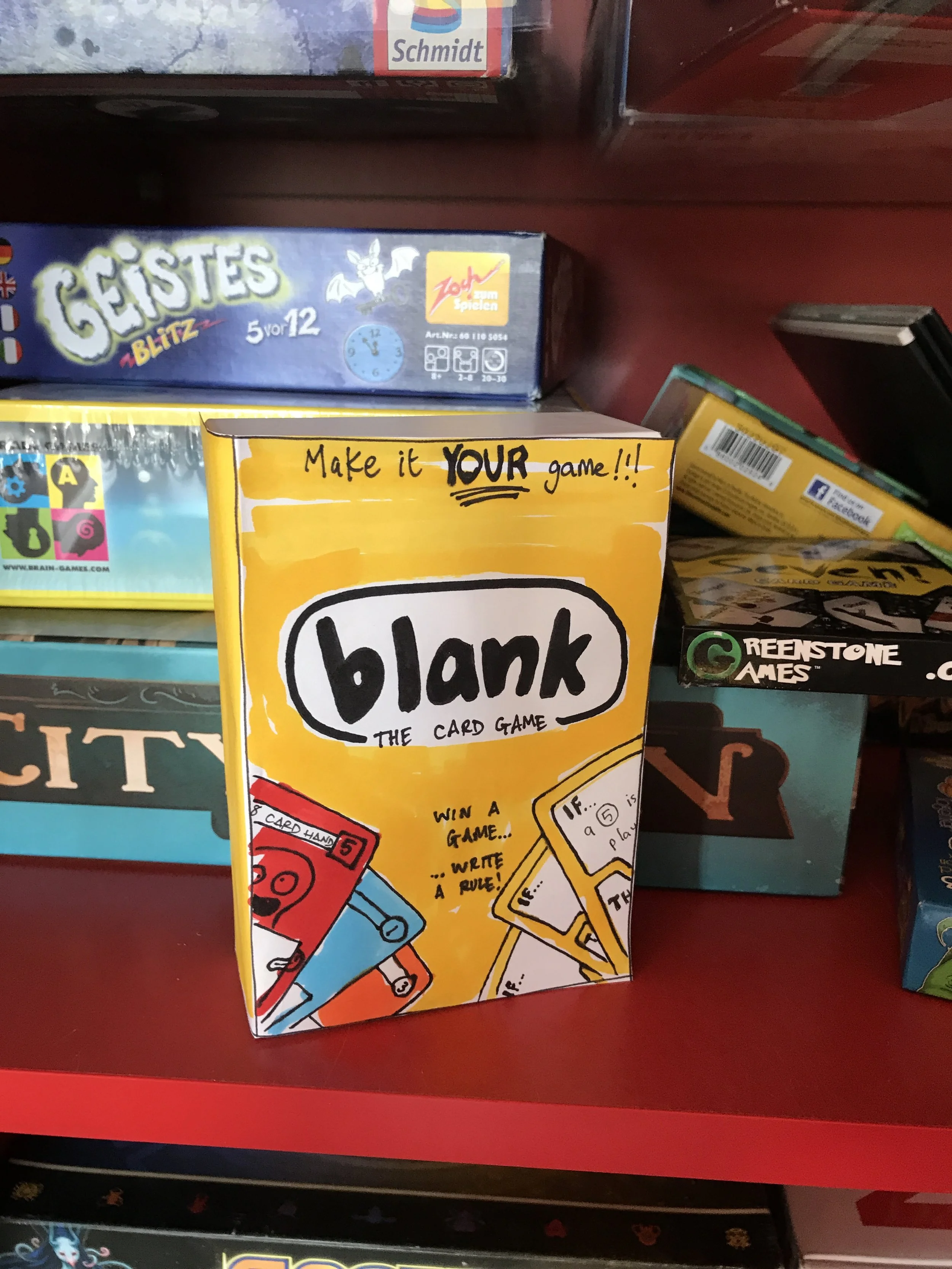
The focus was on colour with a vivid yellow being selected due to its connection to lightbulb moments and the creativity inherent in egg yokes.
We decided to hand draw each piece for this using Sharpies which were then scanned. There are very few straight lines used anywhere on this product to reflect the loose nature of play that comes from the users customising their own cards and creating their own rules.